Siren pictures from my latest trip
I recently got back from about a week long trip to the interior of British Columbia, and I got pictures of a siren in Vancouver, a siren in Greenwood, and a siren in Nelson. As usual, sorry for the low picture quality, my camera is pretty well busted. There only appears to be one siren left in Nelson, though apparently there used to be three, all CLM Omnis.
- Attachments
-
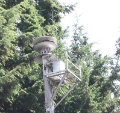
- Nelson, BC, CLM Omni, end of Kokanee st.
- DSCF5180.JPG (99.05 KiB) Viewed 4157 times
-
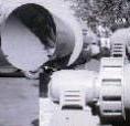
- Greenwood, BC, Fedelcode Model 2, corner of S.Government st. and Deadwood st.
- DSCF5197.JPG (225.25 KiB) Viewed 4157 times
-
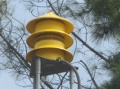
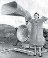
- Vancouver, BC, B&N Mobil Directo, Victoria park
- DSCF5154.JPG (133.47 KiB) Viewed 4157 times
-
- Vancouver, BC, B&N Mobil Directo, Victoria park
- DSCF5158.JPG (198.87 KiB) Viewed 4157 times
-
- Vancouver, BC, B&N Mobil Directo, Victoria park
- DSCF5157.JPG (107.06 KiB) Viewed 4157 times
-
- Vancouver, BC, B&N Mobil Directo, Victoria park
- DSCF5156.JPG (238.86 KiB) Viewed 4157 times
-
- Vancouver, BC, B&N Mobil Directo, Victoria park
- DSCF5152.JPG (108.17 KiB) Viewed 4157 times
-
- Vancouver, BC, B&N Mobil Directo, Victoria park
- DSCF5151.JPG (155.8 KiB) Viewed 4157 times
-
- Vancouver, BC, B&N Mobil Directo, Victoria park
- DSCF5146.JPG (165.69 KiB) Viewed 4157 times
-
- Vancouver, BC, B&N Mobil Directo, Victoria park
- DSCF5145.JPG (118.8 KiB) Viewed 4157 times
-
Hacksaw
- Registered User

- Posts: 1313
- Joined: Wed May 17, 2006 11:38 pm
- Real Name: Mike H
- Location: San Jose, CA
Re: Siren pictures from my latest trip
That CLM Omni service platform reminds me of most of the sirens in San Jose having those:
https://www.google.com/maps/@37.221416, ... !2e0?hl=en
But, those MD platform look to make servicing easier than using a bucket truck.
https://www.google.com/maps/@37.221416, ... !2e0?hl=en
But, those MD platform look to make servicing easier than using a bucket truck.
-
coastalsyrolover
- Registered User
- Posts: 1777
- Joined: Thu Feb 27, 2014 10:01 pm
- Real Name: Christian Long
- Location: Wonderful Western Oregon.
Re: Siren pictures from my latest trip
That sign... That was... Wow. Just beautiful really.
Own and love a Thunderbolt 1000 and a Model 5.
I have many hobbies and interests. And I love them all.
Christian, Lima, Oscah, November, Golf.
I have many hobbies and interests. And I love them all.
Christian, Lima, Oscah, November, Golf.
-
lilrags16
- Registered User
- Posts: 186
- Joined: Sun Jun 01, 2014 2:21 am
- Real Name: Brandon
- YouTube Username: lilrags16
- Location: 44.0269° N, 116.9686° W
- Contact: Website
Re: Siren pictures from my latest trip
"Hunger games" font??coastalsyrolover wrote:That sign... That was... Wow. Just beautiful really.
Brandon Ragsdale,
Brandon Ragsdale, Some wild kid
Brandon Ragsdale, Some wild kid

Re: Siren pictures from my latest trip
It's actually a common font for metal signs like these. You'd be surprised.lilrags16 wrote:"Hunger games" font??coastalsyrolover wrote:That sign... That was... Wow. Just beautiful really.
-
coastalsyrolover
- Registered User
- Posts: 1777
- Joined: Thu Feb 27, 2014 10:01 pm
- Real Name: Christian Long
- Location: Wonderful Western Oregon.
Re: Siren pictures from my latest trip
Lol in any font that is an amazing sign! Here in the US we just tear em down because "They pose bad memories for older folk and were too loud and blah blah." Or if they don't they just let them sit and rot on a poleMark N wrote:It's actually a common font for metal signs like these. You'd be surprised.lilrags16 wrote:"Hunger games" font??coastalsyrolover wrote:That sign... That was... Wow. Just beautiful really.
Own and love a Thunderbolt 1000 and a Model 5.
I have many hobbies and interests. And I love them all.
Christian, Lima, Oscah, November, Golf.
I have many hobbies and interests. And I love them all.
Christian, Lima, Oscah, November, Golf.
Re: Siren pictures from my latest trip
Actually it is pretty much the same up here. This article about North Vancouver's Mobil Directo sums it up pretty well. http://scoutmagazine.ca/2012/02/23/you- ... aid-siren/Lol in any font that is an amazing sign! Here in the US we just tear em down because "They pose bad memories for older folk and were too loud and blah blah." Or if they don't they just let them sit and rot on a pole
Last edited by clm 10 12 on Fri Aug 22, 2014 8:21 am, edited 1 time in total.
Re: Siren pictures from my latest trip
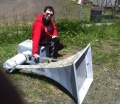
I didn't put this picture in my original post because of the low image quality, but I figured some people might be interested in seeing it. These plaques are on the poles of most air raid sirens in BC that have wooden poles [this one is on the omni CLM in Nelson]. I don't ever recall seeing one on a siren with a metal pole.
- Attachments
-
- DSCF5172.JPG (123.17 KiB) Viewed 3952 times
-
Siren_Dude
- Registered User
- Posts: 623
- Joined: Mon Apr 13, 2009 5:06 pm
- Location: Toronto, ON Canada
Re: Siren pictures from my latest trip
Thanks for all the pictures, they look awesome! That plaque is really interesting, haven't seen one like that in Ontario.
Your Canadian Siren Expert!
https://www.youtube.com/c/ColdWarCanada
https://www.youtube.com/c/ColdWarCanada
Return to “Main Outdoor Warning Sirens Board”
Who is online
Users browsing this forum: Ahrefs [Bot] and 39 guests